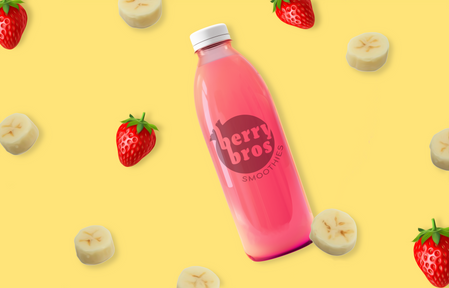
Berry Bros. Smoothies


Description:
Berry Bros. Smoothies, a family-owned shop promoting healthy living, tasked me with developing a brand that highlights their mission of offering delicious, nutritious smoothies for an active lifestyle.


I designed the Berry Bros. Smoothies logo with a blueberry to reflect the brand name and chose vibrant fruit-inspired colors, like those of berries, bananas, and pomegranates. Using organic shapes and soft, vibrant tones, I created
a welcoming, family-oriented design that aligns with the owners' vision.
Process:


Before designing, I met with clients to understand their vision—keywords like "energized," "family-oriented," and "bold." After creating and gaining approval for a mood board of colors and typefaces, I sketched logo concepts featuring a berry motif inspired by the business name.


Once the logo mark was selected, I proceeded to apply the colors to the design. I chose a dark pink-purple shade, reminiscent of a pomegranate,
a vibrant yellow similar to a banana, to evoke energy, and a light pink, akin to a strawberry banana smoothie.

Once the logo mark was approved, I created mockups and developed
a comprehensive branding system, demonstrating how the logo would be applied across various products. Additionally, I designed a social media strategy to effectively promote the brand.


